There is something about a beautifully dressed bed that stops you in your tracks. You walk into a room and instantly feel like you have checked into a boutique hotel because everything looks considered, calm, and quietly luxurious. More often than not, the secret lies in the bedding. And if you have been searching for floral bedding ideas that actually work, you are in the right place.
Florals have a long history of dividing opinion. Done wrong, they can look busy or dated. Done right, they are one of the easiest ways to bring warmth, personality, and an elevated feel to any bedroom — without a renovation or a designer budget. Here are five ideas that genuinely look expensive, along with the styling tips that make all the difference.
1. The Tonal Floral: One Colour Family, Multiple Textures for Your Floral Bedding Ideas
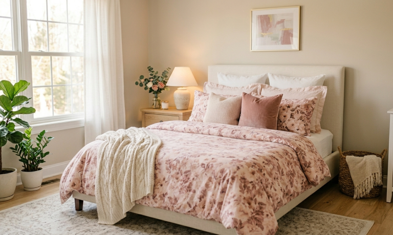
If you want to look effortlessly put-together, tonal florals are your best friend. This approach involves choosing a floral duvet or quilt cover where the print stays within a single colour family. Think dusty rose blooms on a blush background, or cream florals layered onto warm ivory linen.
What makes it feel expensive is the restraint. Instead of competing colours fighting for attention, your eye is drawn to the texture and the subtle variation in tone. It reads as intentional and serene, two qualities that always signal quality.
How to style it:
Layer a solid-coloured throw in the deepest shade of your floral print across the foot of the bed. This grounds the look and stops it from feeling too soft.
Choose pillowcases in the same base colour as the duvet cover rather than the floral print itself. This creates a clean, hotel-like effect.
Bring in one natural texture like a woven cushion, a rattan headboard, or a jute rug, to add depth without adding more colour.
If your walls are white or cream, this bedding style will feel quietly romantic. Against a deeper wall colour like terracotta or sage, it becomes dramatically luxurious.
This is the floral bedding idea I always recommend to anyone who finds floral prints intimidating. It gives you all the beauty of botanicals with none of the visual noise.
Achieve a timeless, romantic feel in your bedroom by pairing a soft, watercolor floral duvet with velvet accents and warm lighting for a cozy, sophisticated retreat.
2. The Vintage Botanical: Dark Background, Dramatic Blooms
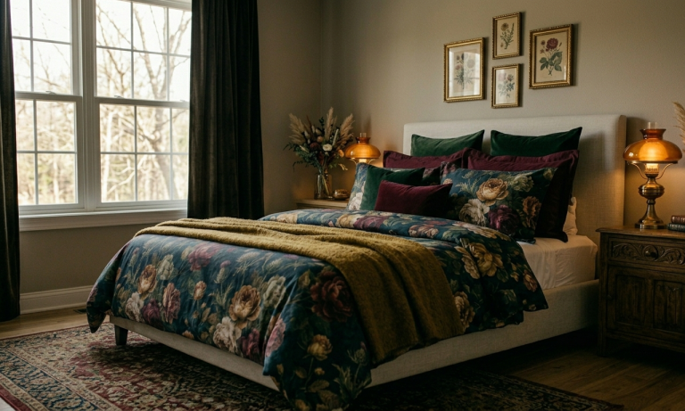
Dark-background floral bedding is having a serious moment, and for very good reason. A duvet cover printed with large, painterly blooms on a deep navy, forest green, or charcoal base looks like it belongs in an editorial spread. It is unexpected, bold, and it photographs beautifully.
The vintage botanical look, as one of the five floral bedding ideas, is inspired by old botanical illustrations, the kind you see framed in antique shops. Things like detailed roses, peonies, or wildflowers with a slightly faded, heritage quality to the print. This style works especially well in bedrooms with wooden furniture, brass accents, or exposed beams.
How to style it:
Keep your pillowcases in a solid colour that picks up one shade from the print, like a deep green, dusty mauve, or warm rust. Avoid white pillowcases with dark-background florals, as the contrast can look stark rather than chic.
Layer a chunky knit throw or a velvet blanket across the bed for texture. The softness of the fabric balances the drama of the print.
Choose bedside lamps with warm-toned bulbs. Cooler light makes dark bedding look flat, while warm light makes it glow.
Frame a simple botanical print on the wall opposite the bed. It ties the room together and makes the bedding feel like part of a curated scheme rather than a standalone piece.
I’ll be honest here, and say that this look is not for the faint-hearted, but if you commit to it, the payoff is a bedroom that feels genuinely unique.
Embrace a moody, maximalist aesthetic by layering deep jewel tones and lush botanical prints for a bedroom that feels like a cozy, high-end sanctuary.
3. The Neutral Floral: Earthy Tones, Organic Prints
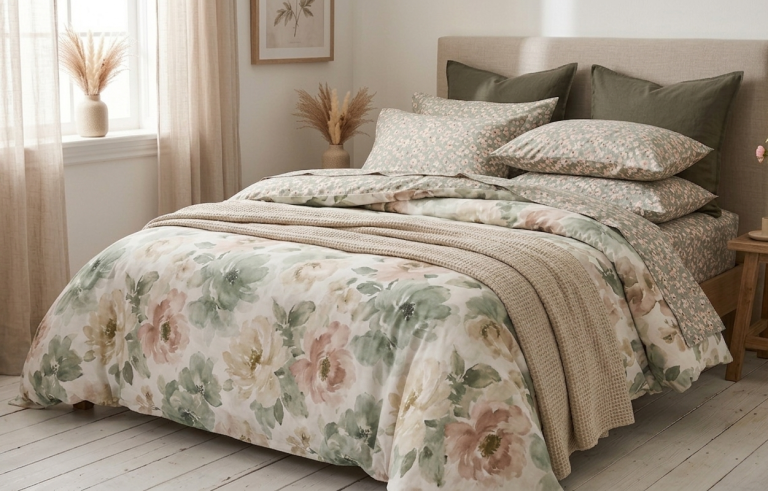
It’s important to remember that not all floral prints are pink and pretty. The earthy, neutral floral is one of the most versatile and sophisticated bedding choices available, and it suits almost every bedroom style, from Scandi minimalism to warm maximalism.
So look for prints that feature muted terracotta, warm ochre, dusty sage, and walnut brown tones. The botanicals themselves often lean toward leaves, stems, and dried flowers rather than full blooms, giving the print an organic, almost hand-drawn quality.
How to style it:
This print pairs beautifully with natural linen. If you can find a duvet cover in a neutral floral linen fabric, it will look and feel like a considered, grown-up bedroom.
Layer a terracotta or warm sand throw across the lower third of the bed.
Use wooden nightstands and ceramic lamps in matte, earthy finishes. The whole room should feel like it belongs to the same warm, unhurried world as the bedding.
Keep the floor simple. A cream or natural jute rug will anchor the bed without competing with the print.
The neutral floral is the option I come back to again and again for creating bedrooms that feel calm, warm, and considered. It is the kind of look that photographs beautifully in natural light and feels even better to wake up in.
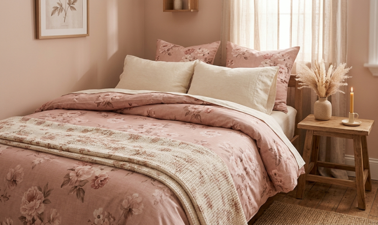
Create a serene, monochromatic sanctuary in your bedroom by layering soft dusty rose floral bedding and rich linen textures under diffused natural light.
4. The Mixed-Scale Floral: Large Print and Small Print Layers
Here is a styling trick for floral bedding ideas that interior designers use constantly, and now you can use it too. Mix floral prints of different scales to create a layered, collected look that feels high-end without being matchy.
The key is to choose prints that share a colour story but differ dramatically in scale. A large, loose watercolour floral on the duvet works beautifully with small, ditsy florals on the pillowcases. The contrast in scale makes both prints feel intentional, and the shared palette ties everything together.
How to style it:
Start with your large-print duvet cover. This is your hero piece. Everything else should complement it, not compete with it.
Choose pillowcases or shams in a small-scale version of the same floral theme — or a delicate ticking stripe in one of the colours from the main print.
Add one or two solid-coloured euro shams in a deep, grounding shade. This gives the eye somewhere to rest among all the pattern.
Add a plain, textured throw at the foot of the bed to bring the mixed prints back to a quiet finish. Think woven cotton, linen, or a soft knit.
The rule of thumb: no more than two floral prints on the bed at once. Three starts to feel chaotic; two feels curated.
When done well, this layered approach is the one that makes guests ask where you got your bedding from. It looks like it took real skill — but mostly it just takes a willingness to experiment with scale.
Elevate your bedroom aesthetic by masterfully mixing scales, pairing an oversized watercolor floral duvet with delicate ditsy-print pillows for a curated, cottagecore-inspired look that feels both intentional and effortless.
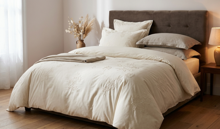
5. The Understated Floral: Embroidered or Jacquard Details
Sometimes the most expensive-looking option is the most subtle one. Embroidered and jacquard-woven floral bedding skips the printed pattern entirely and lets the texture do all the talking.
A white or cream duvet cover with tonal embroidered florals has an heirloom quality that no printed bedding can replicate. The flowers only reveal themselves when light catches the fabric at an angle, and that quiet reveal is exactly what makes it feel special.
Jacquard bedding works similarly when it comes to floral bedding ideas. That is, the pattern is woven into the fabric rather than printed onto it, giving it a weight and richness that immediately reads as quality.
How to style it:
Let the bedding be the focal point. With embroidered or jacquard florals, you do not need bold colours elsewhere. Keep the rest of the room in neutrals so the texture can shine.
This style is exceptionally beautiful with an upholstered headboard, particularly in a soft velvet or linen in a warm greige or deep mushroom tone.
Layer generously. The key to making white or cream bedding look luxurious is volume, and this is achieved using plenty of pillows, a feather-filled duvet with a full, cloud-like loft, and a lightweight blanket folded neatly at the foot.
Add warmth through accessories. Something like a warm-toned lamp, a bunch of dried flowers on the nightstand, or a framed print with a cream or blush background.
Iron or steam your embroidered bedding before use. Crisp, smooth fabric is what separates luxury-looking bedding from ordinary bedding.
Embroidered and jacquard florals are the choice when you want your bedroom to feel genuinely elevated. They are the bedding equivalent of a well-cut, quality fabric.
This serene bedroom corner features a plush bed covered in a crisp, cream-colored duvet with delicate floral embroidery. Layered with greige pillows and a folded throw blanket, the bedding set exudes cozy, inviting comfort.
The Principles That Make Any Type of Floral Bedding Look Expensive
Before you shop, here are the universal rules that apply to every floral bedding idea on this list:
Quality fabric matters more than print when it comes to matters of floral bedding ideas. A beautiful floral on cheap polyester will always look cheap. Prioritise 100% cotton, linen, or a cotton-linen blend. The weight and drape of good fabric is unmistakable.
Less colour, more texture. Expensive-looking bedrooms rarely use more than three colours in the bed dressing. Instead, they layer textures such as smooth cotton, nubby linen, chunky knit, soft velvet.
Proportion and layering. A well-made bed has layers going from a fitted sheet, flat sheet or duvet, decorative pillows, and a throw, and each layer adds visual richness without adding visual noise.
Cohesion with the room. Your bedding does not have to match your curtains, but it should speak the same colour language. Pull one shade from your floral print and repeat it somewhere in the room, like a cushion, a lamp shade, or a plant pot.
Iron and steam. Nothing undermines beautiful bedding like wrinkles. Take five minutes to steam or iron your duvet cover before you make the bed, and the difference is remarkable.
In Conclusion…
Floral bedding is one of the most joyful ways to dress a bedroom, among many others, of course. It brings the outside in, adds personality to what can easily become a very plain room, and creates a space that feels genuinely beautiful rather than just tidy.
If this is something that has appealed to you and you want to give it a try, start with one idea from this list that feels closest to your existing style. Layer carefully, keep colours cohesive, and invest in the best fabric quality your budget allows. From there, the room will start to come together on its own.
Five interactive tools to help you make confident, beautiful choices — from your first floral print to your finishing touches.
What's Your Bedroom Style Personality?
Answer 5 questions to discover your style profile and receive personalised recommendations for floral bedding, colours, textures, and finishing touches.
Question 01 of 05
How does your ideal bedroom make you feel the moment you walk in?
Question 02 of 05
Which word best describes the colours already in your bedroom?
Question 03 of 05
Which texture are you most drawn to for a throw blanket?
Question 04 of 05
How do you feel about patterned bedding in general?
Question 05 of 05
Which of these finishing touches would you add last to your bedroom?
🌸How to use this guide: Click each bedding style to expand the full styling breakdown — what to pair it with, what to avoid, and the one mistake most people make.
Tonal Floral
One colour family
Vintage Botanical
Dark background
Neutral Floral
Earthy, organic tones
Mixed-Scale
Large + small prints
Embroidered
Texture over print
Linen Floral
Natural fabric base
The Golden Fabric Rule: The most important decision is not the print — it's the fabric. A beautiful print on cheap polyester will always look inexpensive. Always choose 100% cotton percale, cotton-linen blend, or pure linen. The weight, drape, and feel of quality fabric is unmistakable — and it photographs beautifully too.
Build your perfect bed layer by layer. Add each element and see your luxury score grow — along with a tip for each layer you add.
Your Bed Builder
Luxury Score
0 / 10
Add layers to begin building your bed.
Add a layer:
The Art of Layering: Expert Rules
What is the right number of pillows for a luxury-looking bed?+
The rule of odd numbers applies. For a queen or king bed, aim for five to seven pillows: two sleeping pillows in decorative cases, two euro shams (large square pillows) behind them, and one to two accent cushions in front. The euro shams create height and structure — without them, even beautiful bedding looks flat.
For a single or double bed, three to five pillows is plenty. More than that starts to look theatrical rather than luxurious.
Should I use a flat sheet if I want a hotel look?+
Yes — the flat sheet (also called a top sheet) is what creates the crisp, turned-down look that hotel beds are known for. Fold it back over the duvet about 30–40cm to reveal a band of clean, pressed cotton. This simple fold adds tremendous polish.
If you find flat sheets impractical for sleeping, make the bed with them purely for visual effect and remove before use. Your morning guests and your Instagram will thank you.
Where exactly should the throw go?+
The lower third. Fold your throw lengthways into thirds and drape it across the bottom third of the bed — not halfway up, not at the very foot edge, but at the lower third. This proportion looks natural, like the throw has been casually placed rather than arranged.
For an alternative look, loosely fold the throw and lay it diagonally across one corner of the bed. This works especially well with textured throws like chunky knits or woven cottons.
How do I make a bed look fuller and more expensive?+
Fill your duvet insert properly. A flat, thin duvet is the number one enemy of a luxurious-looking bed. If your duvet feels flat, either upgrade the fill or add a second duvet inside the same cover. The loft — that full, cloud-like volume — is what makes bedding look expensive in photographs and in person.
Also: always use a duvet cover one size larger than your mattress (a king cover on a queen mattress, for example). The extra fabric creates generous folds and drape rather than a tightly-stretched, thin look.
How do I style a bed without a headboard?+
A wall gallery, a large framed print, or a textile hung above the bed all serve the same structural role as a headboard — they give the bed a visual anchor and make it feel intentional rather than unfinished.
The simplest solution: lean an oversized piece of art or a mirror directly against the wall behind the bed. Leaned art looks relaxed and editorial rather than temporary. Just make sure it is proportional — it should be at least as wide as the headboard would be.
Can I mix floral bedding with other patterns in the room?+
Yes, with one condition: they must share a colour story. The patterns themselves can be completely different — a floral duvet, a striped cushion, and a geometric rug — but if they all speak the same colour language, the room will feel cohesive rather than chaotic.
Vary the scale. A large floral print pairs best with a small or medium secondary pattern. Two large-scale prints in the same room will compete with each other. Two florals in the same room works when one is bold and one is delicate — but this takes confidence to pull off.
The 60-30-10 Colour Ratio Tool
The most reliable rule in interior design. Adjust the sliders to preview how different colour distributions feel — then check the verdict to see if your balance is working.
60%
30%
10%
Linen Cream
Warm Sand
Terracotta
Floral Bedding Colour Pairings
Pre-built palettes designed around the five floral bedding styles. Click any palette to preview it in the ratio tool above.
Colour Rules Worth Knowing
How many colours should a bedroom have?+
As a rule, three colours is the sweet spot for a bedroom that feels considered. Your dominant colour (walls, large textiles) accounts for around 60% of the visual space. Your secondary colour (bedding, curtains, rugs) accounts for around 30%. Your accent colour (cushions, art, accessories) is the remaining 10%.
The mistake most people make: They treat their floral print as introducing one colour, when in reality it introduces four or five. If your floral has five colours in it, pick two to repeat in solid accessories. Let the others exist only in the print.
What colours make a bedroom feel expensive?+
Muted, complex tones always read as more expensive than bright, simple ones. Instead of yellow, choose ochre. Instead of orange, choose terracotta. Instead of pink, choose dusty rose or blush. Instead of green, choose sage, moss, or hunter.
These desaturated, nuanced versions of colours have depth that catches the light differently throughout the day — which is part of what makes rooms look alive rather than flat. Bright primary colours look cheerful; complex, muted tones look considered.
Can I use white walls with floral bedding?+
Yes, but choose the right white. Pure, cool whites (like brilliant white paint) can make floral bedding feel harsh. A warm white — one with yellow, pink, or cream undertones — creates a much softer backdrop. Look for warm whites labelled as "antique white," "old white," "warm ivory," or "linen."
If your walls are pure white and you want to warm the room, the quickest fix is warm-toned lighting. Switch your bulbs to 2700K or warmer. The room will immediately feel softer and your floral bedding will glow.
Your complete room-ready checklist. Work through each section and tick items as you complete them. Your progress is saved while you stay on this page.
This is a space where we strive to make your lives easier. We're helping you to create cosy, organised homes through simple kitchen systems, home resets & lifestyle habits. We share, learn, educate and have fun!